WECC LT’s Hub Forecast Interface
Select the menu item called “Hub Forecasts” to view the full forecast. You will be taken to a pre-defined view of a few selected hubs.
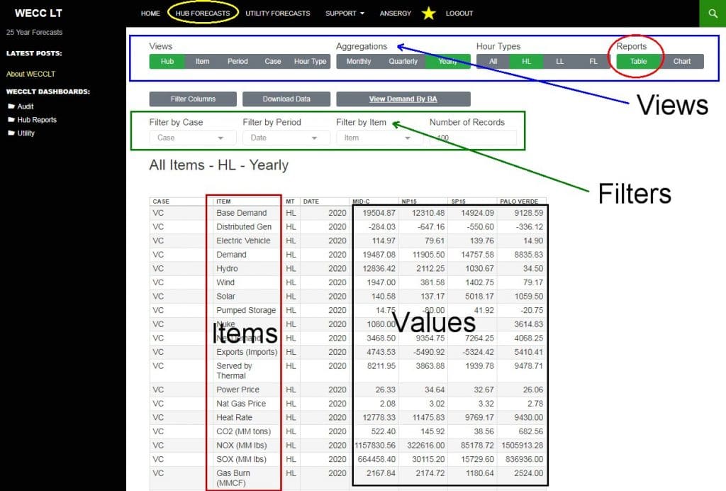
The default view is a table by hub by year for the four traded hubs (PV, SP, NP, and MC). You can add other hubs using the Column Select tool. This view includes all items. There are multiple controls in our Long-Term Interface (LTI), and a brief word on these is warranted.
Views
A “view” defines the columns of data and we offer five views.
- Hub – Each column is a hub with up to fourteen columns of data; this view is seeing the big WECC picture for a single case
- Item – All items are crossed as columns and is most useful for charting one item against another item.
- Period – Each column is a single period set by the Aggregation level you’ve selected. Useful for seeing how the forecast changes across time, especially when the Aggregation is set to yearly.
- Case – WECCLT has five cases; this view will present the cases as columns. This is the preferred view for charting as you can see all cases across time.
- Hour Type – This will return three columns: Heavy Load (HL) Light Load (LL) and Flat (FL). Select this view if you want to plot the on|off spreads.
Aggregation
Ansergy’s forecasts are solved hourly and aggregated up into monthly values in WECCLT. All hourly data is available either as a one-off download or via our FTP server. The hourly data file is very large (900 MB) and can be filtered for selected items via FTP.
There are three aggregation levels: Monthly, Quarterly, and Yearly. You can change the aggregation at any time, in either Table or Chart views.
Hour Types
We offer three different hour types in the hub-level forecasts, already referenced above. The Utility-level forecasts include two additional hour types:
- Solar Peak – Hours 11:00 AM to 3:00 PM
- Solar Off-Ramp – Hours 5:00 PM to 9:00 PM
You can change the Hour Types at any time, in either Table or Chart views.
Filters
WECCLT offers three filter options, depending upon the view selected. In Hub view, you can filter on the following:
- Case
- Period
- Item
You can also filter on Hub by deploying the Column Select feature. With that tool, you can add or remove hubs. All other views each have three filter options, depending on that view.
Charting Reports
Charts are easier to read and interpret than a table, sometimes. To create a plot we recommend you first filter out your data per the following, depending on View:
- Hub View – Filter on one item, one case, one hour type
- Item View – one hub, one case, and use the Column Select to plot like value Items (demand and hydro at MidC, for example)
- Period View – does not plot well
- Case View – Filter to one hub, one item, one hour type
- Hour Type – One item, one hub, one hour type.
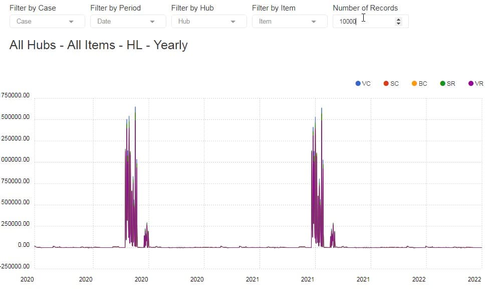
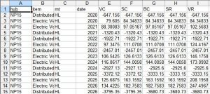
The above is an example of how NOT to make a chart. This example was not filtered and therefore includes all hubs and all items for the five cases.
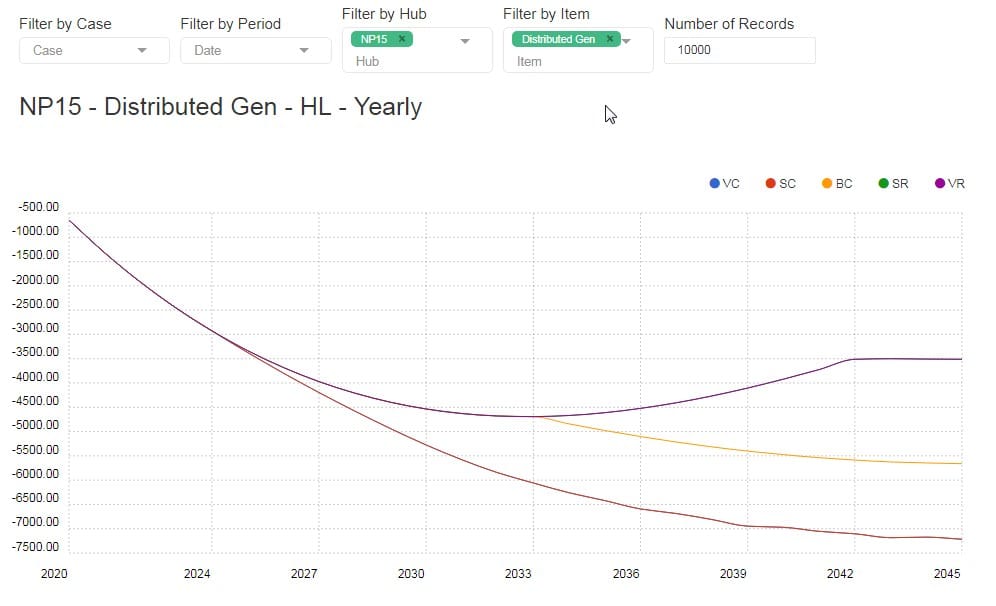
The above is an example of the proper way to apply the filters for a readable plot. In that example, we filtered out NP15 and the Distributed Generation item. You can plot as many items as you like, but often the chart becomes meaningless:
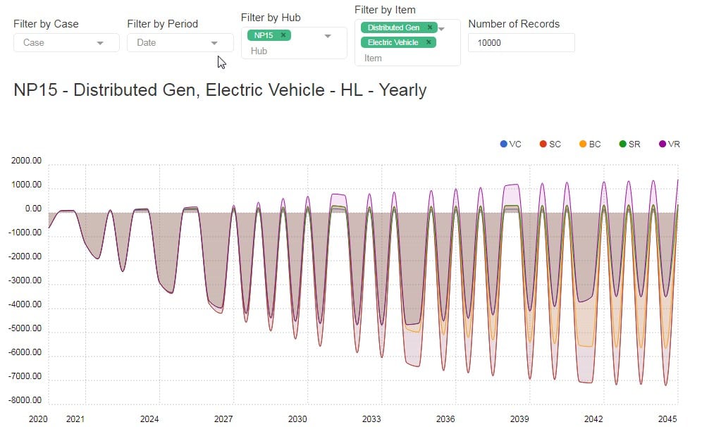
This plot borders on meaningless; it includes two items: Electric Vehicle demand and Distributed Generation.
Downloads
Any report or chart can be downloaded by clicking the Download button. You will get whatever you’ve filtered out; in the above example, you’d get a .csv file with Electric Vehicle and Distributed Generation, aggregated by year, for NP15 HL.
Ansergy also offers its hourly data which can be accessed as a one-time upload via Google Drive or on our secure FTP server.
Dashboards
Our preferred way to view WECCLT data since we can see multiple reports in a single screen.
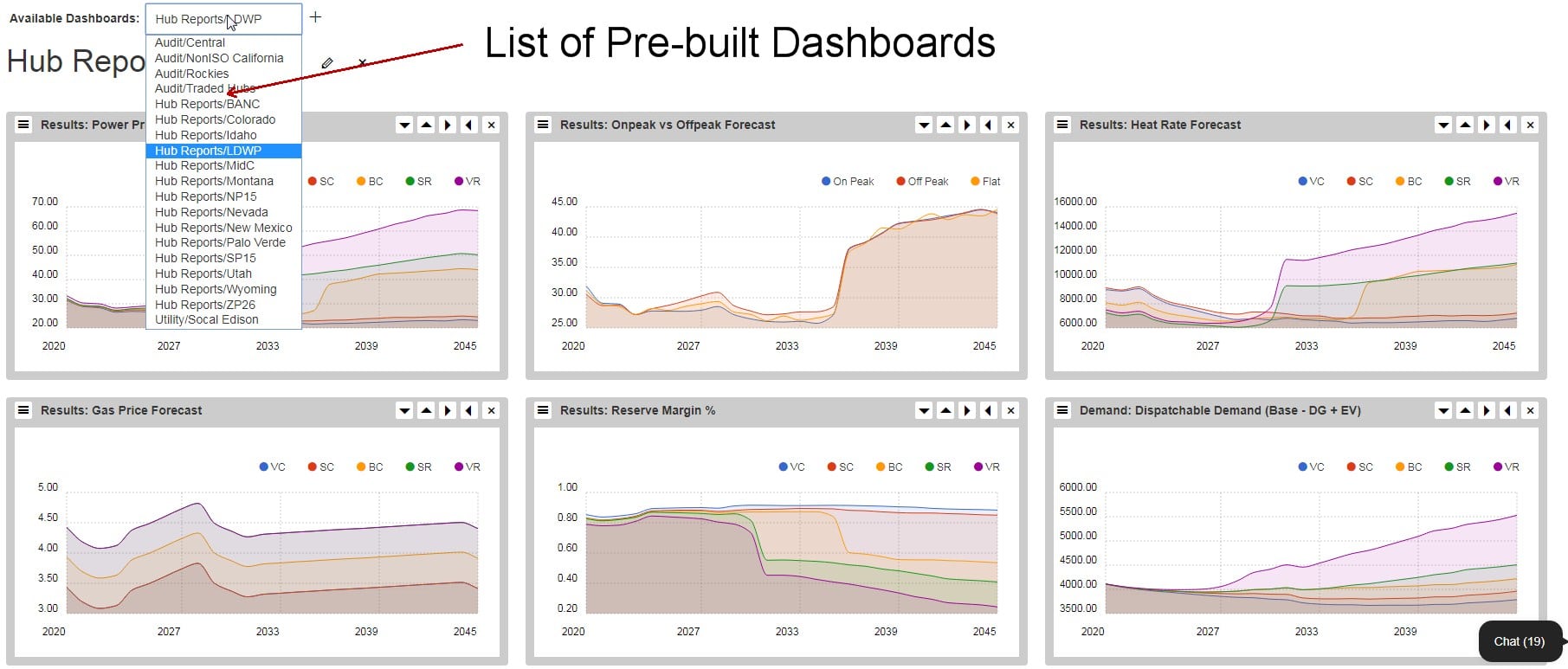
Ansergy’s dashboards are pre-populated to your account. You can also make your own, or we’ll make them for you. There are two ways to make a new dashboard.
Open an existing dashboard and click the “+” icon next to the dashboard name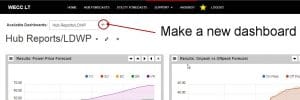
. This will open up a blank dashboard where you can then paste in new reports and assign names to those reports.
- Click the Yellow Star in the menu – this will open up the new dashboard name where you will be prompted to Name the Dashboard and add reports.
Contact Ansergy for Assistance
We are here to help, either with making reports or answering questions. You can reach us on Chat, call, or email.
- Phone: 206 877 0991
- Email: info@ansergy.com