All posts by mtg

Ansergy’s WECC LT – Reports

About Ansergy Reports

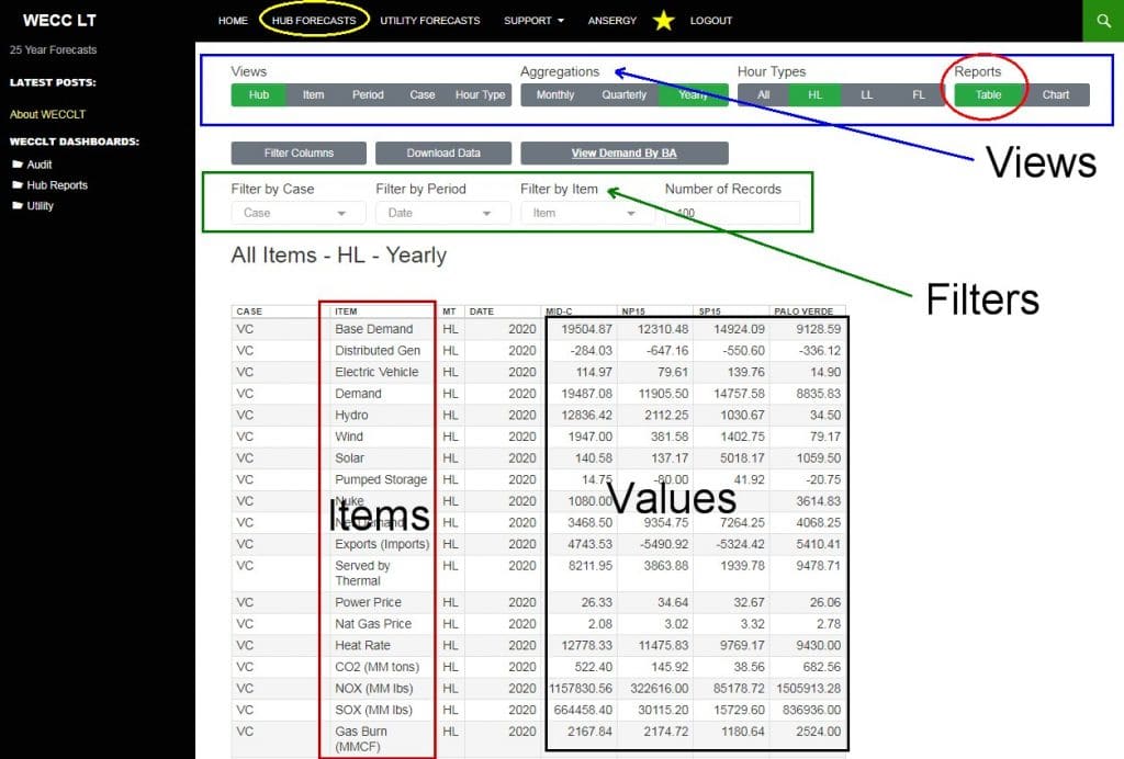
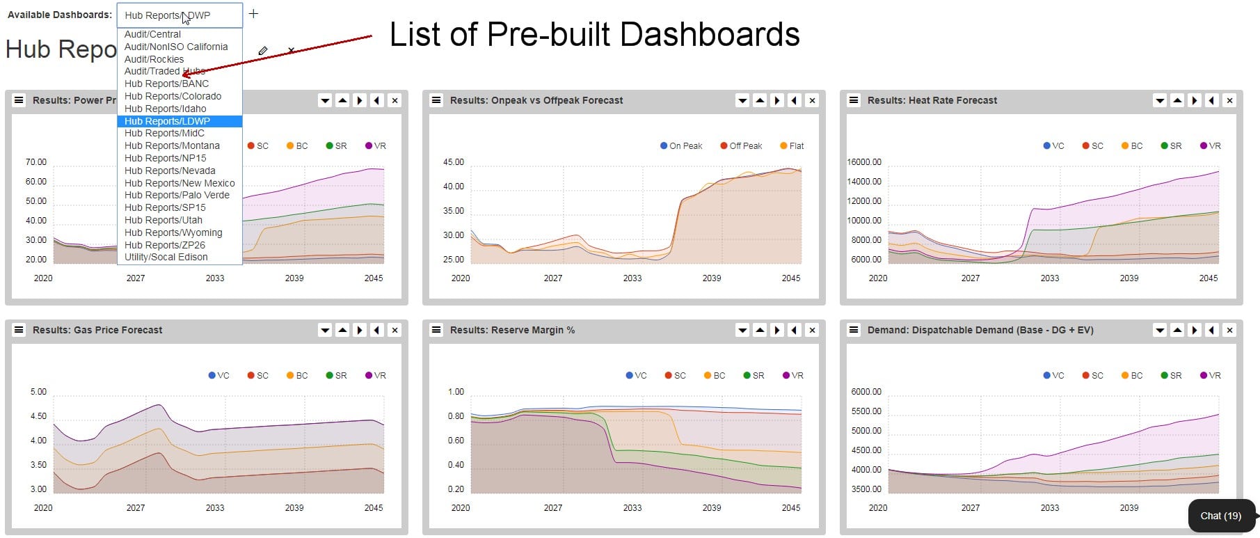
Data is only as good as it is accessible; think needles and haystacks. The WECCLT models generate 797 million hourly forecast records every day; try finding a needle in that veritable universe of haystacks. But it’s not that hard; Ansergy makes it easy to find every needle in just minutes with our proprietary Long Term Interface (LTI). LTI has several features which allow a user to quickly drill down to the most important components of the forecast. We offer five views where we define a view as what the user wants to compare.

Views

  • View By Hub

  •  – all 14 hubs are tabulated by column while items, cases, and periods are listed by row
  • View the entire WECC in one screen, or filter down to just the hubs of most interest.
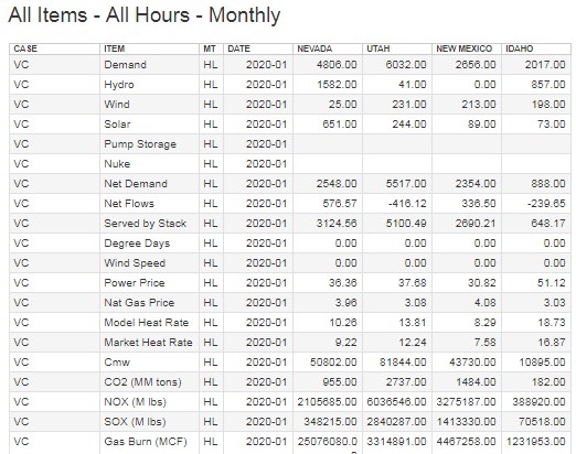
  • In this view, we have filtered to include Nevada, Utah, New Mexico, and Idaho. The view also consists of all items, cases, hour types, and periods (monthly in the example) though you may want to view just one item for multiple hubs.
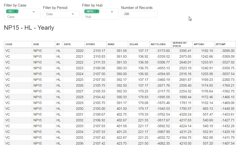
  • This table includes all demand forecasts for every case and all hour types. Drilling deeper, we can view all cases for just one hour type.
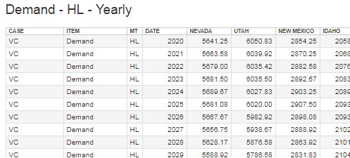
  • Now we’ve filtered down to Heavy Load and switched from Monthly to Yearly totals. You may want to see all cases for a single period.
  • All data sets can be plotted
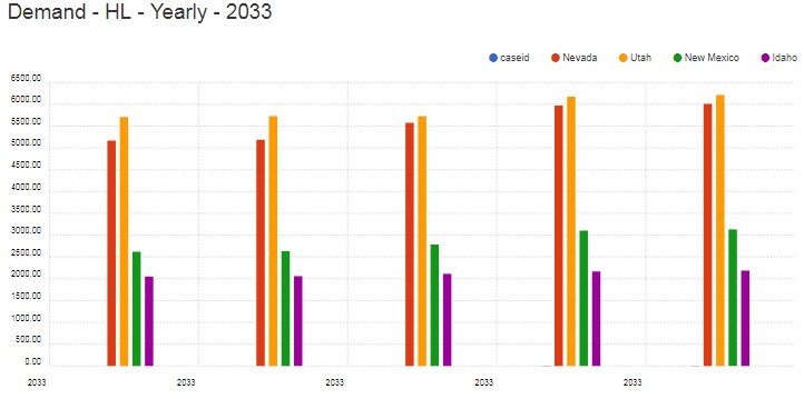
  • Since it was only one year, the Bar Chart option looks best. What about all the years?
  • Multiple dates render best in a line or area chart, so in this example, we selected a line and dropped New Mexico and Idaho from the plot (by unchecking the respective legends). Note that the Utah-Nevada spread is quite volatile for this case (VR). With a click, you can switch items or aggregations.
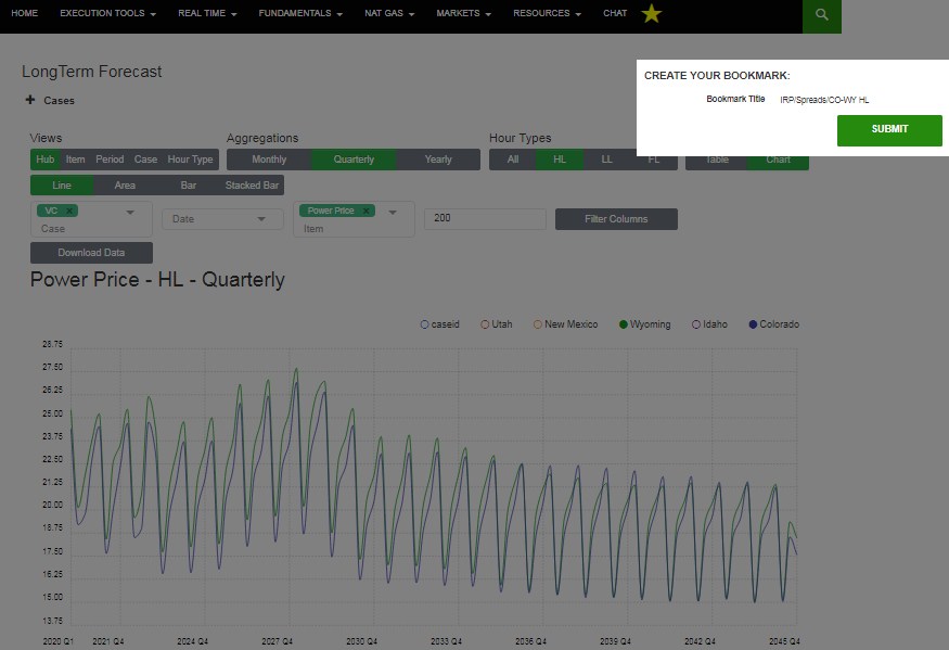
  • With a couple of clicks on the legend, you are now viewing the Colorado-Wyoming quarterly on peak spread for the VR case.
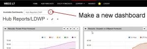
  • Reports are easy to make, but Ansergy makes streamlined with our Bookmark Tool (yellow star at the top-right of the menu).

View by Case

Ansergy generates five cases for each run. It is possible that a case can be customized by a user, but Ansergy offers five Standard Cases by default. In the above table, we’ve stacked items by case by year (the first 20 items are displayed, an additional 25 are available). This is a helpful view to drill into why something is changing as you can see individual forecast items by case. It’s simple to change the period.  We’re looking at 2020, but you can pick any year, quarter, or month (or even all records).
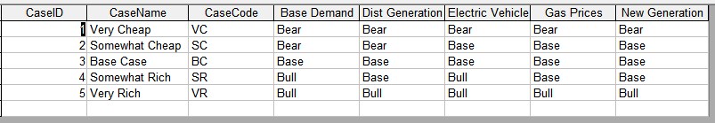
Standard Cases

VC – Very Cheap

This case will return the lowest prices and is comprised of the following assumptions

  • Base Demand – a lower, forward-looking base demand forecast which may be driven by a lower GDP, lesser population growth, more conservation, or other factors (apart from Distributed Generation) which would result in declining loads
  • Distributed Generation (DG) – also known as rooftop solar, the VC case incorporates the most rapid pace of DG adoption plus a higher penetration rate per capita.
  • Electric Vehicles (EV) – The slowest EV adoption rate and assumes a rate less than used by the EIA.
  • New Generation – Reserve margins are more than 20% in all hours; the VC case uses a relatively high amount of new generation (solar, wind, and gas-fired power plants)
  • Gas Price – assumes continued development of new supply and new pipelines all of which result in the most bearish gas price forecast.

SC – Somewhat Cheap

Less bearish than VC, but the second cheapest of the five cases

  • Base Demand – a slightly higher, forward-looking base demand forecast than VC.
  • Distributed Generation (DG) – SC incorporates the same DG forecast as VC.
  • Electric Vehicles (EV) – Baseline (EIA’s) forecast for EVs
  • New Generation – Similar new generation as VC
  • Gas Price – a moderately higher gas price forecast than VC

BC – Base Case

Uses all of our Best Guess estimates

  • Base Demand – Ansergy’s computed 25-year base demand forecast using ten-year average temperatures and the latest GDP and population growth estimates.
  • Distributed Generation (DG) – Ansergy’s baseline DG forecast
  • Electric Vehicles (EV) – Baseline (EIA’s) forecast for EVs
  • New Generation – Staggered new generation by type for each hub by year
  • Gas Price – Ansergy’s baseline gas price forecast.

SR – Somewhat Rich

A more bullish case

  • Base Demand – Base Case base demand increased by a small percentage
  • Distributed Generation (DG) – Ansergy’s bearish DG forecast; assumes regulatory hurdles or declining retail rates, or increasing solar and battery installed costs
  • Electric Vehicles (EV) – Aggressive forecast for EVs which assumes continued regulatory incentives, rapid build outs of charging stations, and high gasoline prices further incentivizing the adoption of EV. This forecast is substantially higher than the EIA’s 25 year EV forecast.
  • New Generation – New generation is deferred a few years creating instances where spinning reserves drop beneath 20%
  • Gas Price – Ansergy’s bullish gas price forecast. Assumes a flatlining of production and very little change in gas transportation capacities.

VR – Very Rich

The most bullish case

  • Base Demand – Base Case base demand increased by a larger percentage
  • Distributed Generation (DG) – Ansergy’s bearish DG forecast; assumes regulatory hurdles or declining retail rates, or increasing solar and battery installed costs
  • Electric Vehicles (EV) – Aggressive forecast for EVs which assumes continued regulatory incentives, rapid build outs of charging stations, and high gasoline prices further incentivizing the adoption of EV. This forecast is substantially higher than the EIA’s 25 year EV forecast.
  • New Generation – New generation is deferred several years creating instances where spinning reserves drop beneath 10%
  • Gas Price – Ansergy’s bullish gas price forecast. Assumes a flatlining of production and very little change in gas transportation capacities.

Case Matrix

Custom Cases

Ansergy built WECClt to easily incorporate any sensitivity a user would like to test. These could include the following scenario types.

  • Hydro – any water year, any group of water years, or even a random water year for each year of the forecast. The latter may be the most accurate way to forecast since that is how real life works. We can also run capacity tests, for example removing the Lower Snake river projects.
  • Temperatures – The standard cases all use the same temperature forecast which is an hourly average of the last 12 years. A user might be interested in testing an ever-increasing temperature and its impact on demand, say a ¼ degree per year. That would result in 2045 seeing about 5 degrees warmer than in 2020. Like hydro, we can also run random temperature years by picking one of the twelve historical years and using those realized temperatures. Temperature and water year can be combined. For example, we could choose 2012 for both the water year and the temperature year.
  • Capacity cases – use a different new generation mix. For example, a case could be all nukes retired by 2028, or all coal is retired by 2035.
  • Transmission – WECClt uses all known lines plus those currently being built, like the Transwestern Express line. We can also perform what-ifs on hypothetical lines or derated or uprated existing lines. These are exciting studies when modeling long-term locational spreads like SP-MidC.
  • Carbon Taxes – Carbon taxes are not a current variable in the standard cases. Sensitivities might include staggered carbon taxes by state.

Chart View by Case

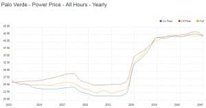
Charts are lovely tools for viewing data across time. This plot is for NP’s heat rates for all five cases.
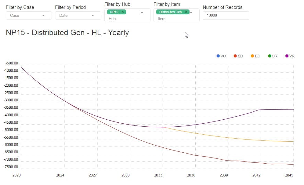
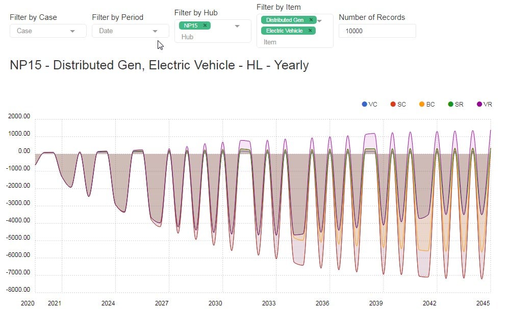
View by Item

Item view is useful for plotting one item against another. Below is an example of the Item View:

Hydro is plotted against Served by Stack for the VC case. The hub isn’t able to keep gas on the margin for a few months each year, and this simulation is done with average water. The problem is exacerbated in heavy water years.
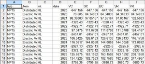
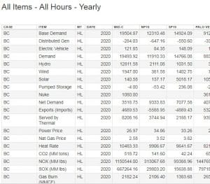
Table View

Easy to download the data, one click and it’s on your desktop.

View by Period

This is a good audit view as it crosses by the period (Month, Quarter or Year).

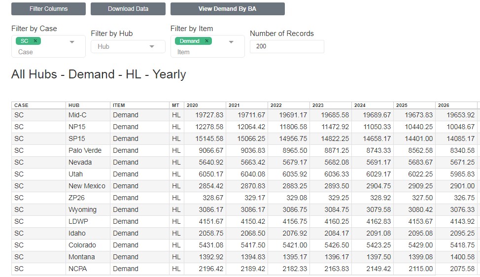
In the above, we are looking at Demand for the SC case for all hubs by year. You can also drill down and view just one hub, all items.
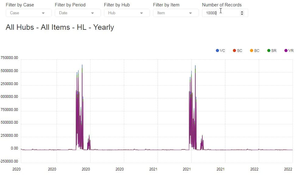
View by Hour Type

The Distributed Generation forecasts destroy on peak demand during the solar peak. That is best seen in a chart.

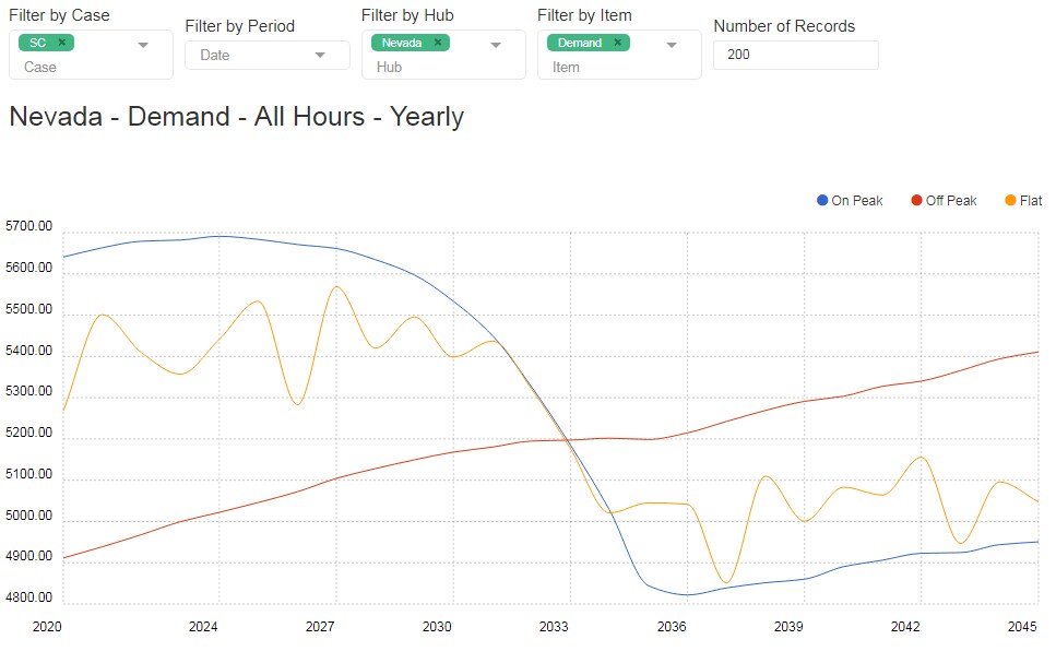
Note the upward sloping off-peak demand, partially driven by night time EV load and the plummeting on-peak. Flat also tanks but not like on-peak. Here are the heat rates:

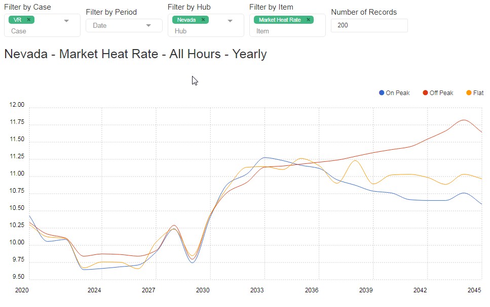
The case is changed, this is VR, but even with the most bullish case, the off-peak heat rate surpasses on-peak by 2035.

Utility Demand Forecast Interface (UDI)

WECC LT loads are computed at a Balancing Authority level and aggregated into Hub Demand. The model calculates four demand types:

  • Base Demand
  • Distributed Generation
  • Electric Vehicles
  • Net Demand

All BA load forecasts are available in a related interface:

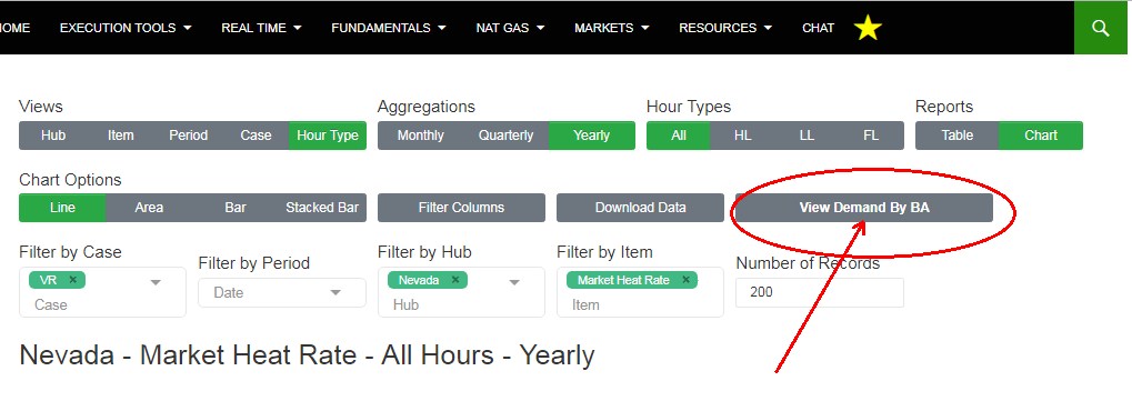
Click View Demand by BA to download and plot BA-level demand forecasts by demand type. This provides full transparency on what is driving hub-level demand forecasts.

The interface (UDI) is similar to the full forecast interface, with a couple of twists.

Aggregations are still Monthly, Quarterly, and Yearly, though hourly data is available. UDI includes two new hour types:

  • Solar Peak – Hours 11-14; this type highlights the peak impact of Distributed Generation on demand
  • Evening – Hours 19-22; these are the peak heat rate hours as there is little DG or wholesale solar.

Versions of UDI can include any utility using the EIA 860 splits. Let us know which utility you’d like modeled, and we can provide the data.

This chart is an area plot of San Diego Gas and Electric’s four demand components by year for on-peak. With a click, we can focus on Solar Peak hours:

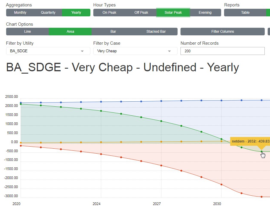
From this, we see a startling result – negative average loads during solar-peak hours. The utility has become a Genco for the rest of the WECC, the ISO’s second ZP. Need to drill deeper, how about monthly?

Every chart comes with a zoom feature to pick out specific strips of dates, here we’ve zoomed into the June 2029 to October 2032, by month, for the Solar Peak hours.

Ansergy’s WECC LT Update – Part Two

Greetings,

Yesterday, we announced our 25-Year forecast service; today we’ll go into greater details on the interfaces and content.

Questions? Please drop us a note or register for a free trial and be sure to request our complementary sample of our 25 year hourly price forecasts.

Trial Now


WECC LT’s Hub Forecast Interface

Select the menu item called “Hub Forecasts” to view the full forecast. You will be taken to a pre-defined view of a few selected hubs.

The default view is a table by hub by year for the four traded hubs (PV, SP, NP, and MC). You can add other hubs using the Column Select tool. This view includes all items. There are multiple controls in our Long-Term Interface (LTI), and a brief word on these is warranted.

Views

A “view” defines the columns of data and we offer five views.

  • Hub – Each column is a hub with up to fourteen columns of data; this view is seeing the big WECC picture for a single case
  • Item – All items are crossed as columns and is most useful for charting one item against another item.
  • Period – Each column is a single period set by the Aggregation level you’ve selected. Useful for seeing how the forecast changes across time, especially when the Aggregation is set to yearly.
  • Case – WECCLT has five cases; this view will present the cases as columns. This is the preferred view for charting as you can see all cases across time.
  • Hour Type – This will return three columns: Heavy Load (HL) Light Load (LL) and Flat (FL). Select this view if you want to plot the on|off spreads.

Aggregation

Ansergy’s forecasts are solved hourly and aggregated up into monthly values in WECCLT. All hourly data is available either as a one-off download or via our FTP server. The hourly data file is very large (900 MB) and can be filtered for selected items via FTP.

There are three aggregation levels: Monthly, Quarterly, and Yearly. You can change the aggregation at any time, in either Table or Chart views.

Hour Types

We offer three different hour types in the hub-level forecasts, already referenced above. The Utility-level forecasts include two additional hour types:

  • Solar Peak – Hours 11:00 AM to 3:00 PM
  • Solar Off-Ramp – Hours 5:00 PM to 9:00 PM

You can change the Hour Types at any time, in either Table or Chart views.

Filters

WECCLT offers three filter options, depending upon the view selected. In Hub view, you can filter on the following:

  • Case
  • Period
  • Item

You can also filter on Hub by deploying the Column Select feature. With that tool, you can add or remove hubs. All other views each have three filter options, depending on that view.


Charting Reports

Charts are easier to read and interpret than a table, sometimes. To create a plot we recommend you first filter out your data per the following, depending on View:

  • Hub View – Filter on one item, one case, one hour type
  • Item View – one hub, one case, and use the Column Select to plot like value Items (demand and hydro at MidC, for example)
  • Period View – does not plot well
  • Case View – Filter to one hub, one item, one hour type
  • Hour Type – One item, one hub, one hour type.

The above is an example of how NOT to make a chart. This example was not filtered and therefore includes all hubs and all items for the five cases.

The above is an example of the proper way to apply the filters for a readable plot. In that example, we filtered out NP15 and the  Distributed Generation item. You can plot as many items as you like, but often the chart becomes meaningless:

This plot borders on meaningless; it includes two items: Electric Vehicle demand and Distributed Generation.

Downloads

Any report or chart can be downloaded by clicking the Download button. You will get whatever you’ve filtered out; in the above example, you’d get a .csv file with Electric Vehicle and Distributed Generation, aggregated by year, for NP15 HL.

Ansergy also offers its hourly data which can be accessed as a one-time upload via Google Drive or on our secure FTP server.

Dashboards

Our preferred way to view WECCLT data since we can see multiple reports in a single screen.

Ansergy’s dashboards are pre-populated to your account. You can also make your own, or we’ll make them for you. There are two ways to make a new dashboard.

Open an existing dashboard and click the “+” icon next to the dashboard name

. This will open up a blank dashboard where you can then paste in new reports and assign names to those reports.

  • Click the Yellow Star in the menu – this will open up the new dashboard name where you will be prompted to Name the Dashboard and add reports.

Contact Ansergy for Assistance

We are here to help, either with making reports or answering questions. You can reach us on Chat, call, or email.

  • Phone: 206 877 0991
  • Email: info@ansergy.com


Schedule a Call


About WECCLT


Ansergy, the WECC’s leading provider of Forecasts and Data, has just extended its forecasts out another twenty years via its new service, WECCLT. The service has many features making it truly unique, including:

  • Updated Daily – though not a lot changes, day-on-day, fresh forecasts are always preferred to stale.
  • Five Cases – All five cases are refreshed each day
  • Full Output – From gas prices to transmission flows, all outputs from the model are available in our WECCLT web interface or downloadable
  • Web Interface – access the forecast through Ansergy’s intuitive online interfaces. View tables or charts, save as bookmarks or combine multiple reports into dashboards
  • Supported – Ansergy’s team of analysts are online and available for support via integrated chat
  • Customizable – we picked five cases, an option exists for you to define your cases

Use it to price your structured transactions or to support your IRP team; always online, always fresh, each of the five scenarios is refreshed daily. Online charting and query tools make finding the needles easy.  Fourteen price points mean every WECC asset has its own unique 25-year hourly price and heat rate forecast.

Our proprietary online interface makes it easy to get just the right report. View all 40+ forecast items (inputs and outputs) or filter down and focus in on demand. Downloading is easy; all WECCLT data is a click from your desktop.

Questions about our models, sources, or assumptions? No problem, we have staff online during business hours ready to answer any questions. Organizing your reports is made easy with our dashboard views from which you can view multiple locations, items, and even different aggregations (hourly, daily monthly, quarterly, or yearly).

WECCLT makes sense for the right reasons:

  • Accurate and timely. Ansergy forecasts WECC’s five-year market every day. The 25-year starts where the five-year leaves off.
  • Affordable – Times are tough, for less than the cost of a summer intern your firm will be using the industry’s best forecasts

Call or email for additional information or forecasts samples.

  • Team Ansergy
  • info@ansergy.com
  • 206-877-0991
  • Learn More – wecclt.com

About Hub Forecast Interface

WECC LT’s Hub Forecast Interface

Select the menu item called “Hub Forecasts” to view the full forecast. You will be taken to a pre-defined view of a few selected hubs.

The default view is a table by hub by year for the four traded hubs (PV, SP, NP, and MC). You can add other hubs using the Column Select tool. This view includes all items. There are multiple controls in our Long-Term Interface (LTI), and a brief word on these is warranted.

Views

A “view” defines the columns of data and we offer five views.

  • Hub – Each column is a hub with up to fourteen columns of data; this view is seeing the big WECC picture for a single case
  • Item – All items are crossed as columns and is most useful for charting one item against another item.
  • Period – Each column is a single period set by the Aggregation level you’ve selected. Useful for seeing how the forecast changes across time, especially when the Aggregation is set to yearly.
  • Case – WECCLT has five cases; this view will present the cases as columns. This is the preferred view for charting as you can see all cases across time.
  • Hour Type – This will return three columns: Heavy Load (HL) Light Load (LL) and Flat (FL). Select this view if you want to plot the on|off spreads.

Aggregation

Ansergy’s forecasts are solved hourly and aggregated up into monthly values in WECCLT. All hourly data is available either as a one-off download or via our FTP server. The hourly data file is very large (900 MB) and can be filtered for selected items via FTP.

There are three aggregation levels: Monthly, Quarterly, and Yearly. You can change the aggregation at any time, in either Table or Chart views.

Hour Types

We offer three different hour types in the hub-level forecasts, already referenced above. The Utility-level forecasts include two additional hour types:

  • Solar Peak – Hours 11:00 AM to 3:00 PM
  • Solar Off-Ramp – Hours 5:00 PM to 9:00 PM

You can change the Hour Types at any time, in either Table or Chart views.

Filters

WECCLT offers three filter options, depending upon the view selected. In Hub view, you can filter on the following:

  • Case
  • Period
  • Item

You can also filter on Hub by deploying the Column Select feature. With that tool, you can add or remove hubs. All other views each have three filter options, depending on that view.

Charting Reports

Charts are easier to read and interpret than a table, sometimes. To create a plot we recommend you first filter out your data per the following, depending on View:

  • Hub View – Filter on one item, one case, one hour type
  • Item View – one hub, one case, and use the Column Select to plot like value Items (demand and hydro at MidC, for example)
  • Period View – does not plot well
  • Case View – Filter to one hub, one item, one hour type
  • Hour Type – One item, one hub, one hour type.

The above is an example of how NOT to make a chart. This example was not filtered and therefore includes all hubs and all items for the five cases.

The above is an example of the proper way to apply the filters for a readable plot. In that example, we filtered out NP15 and the  Distributed Generation item. You can plot as many items as you like, but often the chart becomes meaningless:

This plot borders on meaningless; it includes two items: Electric Vehicle demand and Distributed Generation.

Downloads

Any report or chart can be downloaded by clicking the Download button. You will get whatever you’ve filtered out; in the above example, you’d get a .csv file with Electric Vehicle and Distributed Generation, aggregated by year, for NP15 HL.

Ansergy also offers its hourly data which can be accessed as a one-time upload via Google Drive or on our secure FTP server.

Dashboards

Our preferred way to view WECCLT data since we can see multiple reports in a single screen.

Ansergy’s dashboards are pre-populated to your account. You can also make your own, or we’ll make them for you. There are two ways to make a new dashboard.

Open an existing dashboard and click the “+” icon next to the dashboard name

. This will open up a blank dashboard where you can then paste in new reports and assign names to those reports.

  • Click the Yellow Star in the menu – this will open up the new dashboard name where you will be prompted to Name the Dashboard and add reports.

Contact Ansergy for Assistance

We are here to help, either with making reports or answering questions. You can reach us on Chat, call, or email.

  • Phone: 206 877 0991
  • Email: info@ansergy.com


About WECCLT

Ansergy, the WECC’s leading provider of Forecasts and Data, has just extended its forecasts out another twenty years via its new service, WECCLT. The service has many features making it truly unique, including:

  • Updated Daily – though not a lot changes, day-on-day, fresh forecasts are always preferred to stale.
  • Five Cases – All five cases are refreshed each day
  • Full Output – From gas prices to transmission flows, all outputs from the model are available in our WECCLT web interface or downloadable
  • Web Interface – access the forecast through Ansergy’s intuitive online interfaces. View tables or charts, save as bookmarks or combine multiple reports into dashboards
  • Supported – Ansergy’s team of analysts are online and available for support via integrated chat
  • Customizable – we picked five cases, an option exists for you to define your cases

Use it to price your structured transactions or to support your IRP team; always online, always fresh, each of the five scenarios is refreshed daily. Online charting and query tools make finding the needles easy.  Fourteen price points mean every WECC asset has its own unique 25-year hourly price and heat rate forecast.

Our proprietary online interface makes it easy to get just the right report. View all 40+ forecast items (inputs and outputs) or filter down and focus in on demand. Downloading is easy; all WECCLT data is a click from your desktop.

Questions about our models, sources, or assumptions? No problem, we have staff online during business hours ready to answer any questions. Organizing your reports is made easy with our dashboard views from which you can view multiple locations, items, and even different aggregations (hourly, daily monthly, quarterly, or yearly).

WECCLT makes sense for the right reasons:

  • Accurate and timely. Ansergy forecasts WECC’s five-year market every day. The 25-year starts where the five-year leaves off.
  • Affordable – Times are tough, for less than the cost of a summer intern your firm will be using the industry’s best forecasts

Call or email for additional information or forecasts samples.

  • Team Ansergy
  • info@ansergy.com
  • 206-877-0991
  • Learn More – wecclt.com